Web Components for Beginners: Is it time to DITCH the frameworks?
Within our expansive universe we find ourselves surrounded by an evolving constellation of technologies for building websites: frameworks, libraries, HTML5 APIs, WebAssembly, service workers, progressive web apps, modern CSS features, eccetera, eccetera.
But surprisingly, a lot of developers have yet to explore HTML Web Components. I'm not talking about React components!
Web Components are a native feature of the web, which means they don't rely on outside libraries or special setups.
We often overlook how much HTML, CSS, and JavaScript have continued to grow, even if the pace is gradual. And I think there's really something quite compelling in sticking with what's standard and not what's trending on GitHub for the month.
That curiosity pushed me to take a closer look at Web Components, and even try them out in a real-world project I was recently assigned. This article is the aggregation of my learnings and thoughts.
What Are HTML Web Components?
Think of Web Components as the building blocks for your applications. Each one is a self-contained piece of UI that you can drop into a page, reuse across projects, or even share with other developers without worrying about breaking things.
These concepts will feel familiar to anyone who's used component-based frameworks such as React, Vue or Angular.
But in contrast to those frameworks, HTML Web Components allow you to define custom HTML tags that then behave like native elements.
For instance, you might create a component called <my-button>, that the browser then treats as a native element.
React and the lark don't create real HTML elements like <my-button> in the DOM. They render components as functions or classes that ultimately output real HTML elements (like <button> or <div>) under the hood. A React component called MyButton might render to <button> in the actual DOM, not <my-button>.
And it was this aspect that really caught my attention. Web Components improve semantic clarity by introducing these domain-specific elements with real tag names.
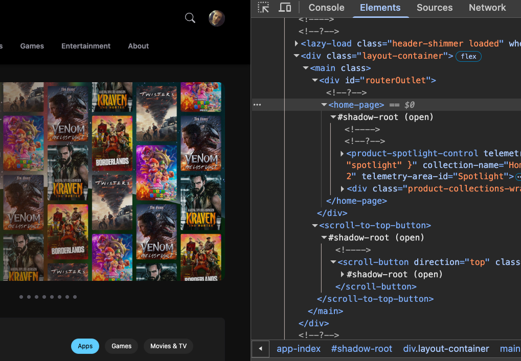
You can see web components in action on the Microsoft Store by accessing the DOM in dev tools:
Let's Create Our First Custom Element
At its very basic, it looks something like this:
class MyButton extends HTMLElement {
constructor() {
super();
this.innerHTML = ``;
}
}
customElements.define('my-button', MyButton);
You create a JavaScript class that extends the built-in HTMLElement.
super() does what super() does and invokes the constructor of HTMLElement. This sets up everything the browser needs internally for your custom element to behave like a regular HTML element.
Once, instantiated, it directly injects an HTML <button> element labeled "Click Me!" as part of its own content.
After defining the component, it's registered as a custom element using customElements.define('my-button', MyButton). This tells the browser that whenever it sees the <my-button> tag in the HTML, it should create an instance of the MyButton class.
You can also take a less declarative approach using DOM manipulation methods:
class MyButton extends HTMLElement {
  constructor() {
    super();

    const button = document.createElement('button');
    button.textContent = 'Click Me!';

    this.appendChild(button);
  }
}

customElements.define('my-button', MyButton);
This version avoids injecting raw HTML as a string and instead uses the DOM API to create and insert the button node.
Once registered, you can drop <my-button></my-button> right into your HTML, just like a regular tag.
<!DOCTYPE html>
<html lang="en">
<head>
  <meta charset="UTF-8">
  <title>Custom Button Example</title>
</head>
<body>
  <h1>Using a Custom Web Component</h1>

  <!-- Custom element in use -->
  <my-button></my-button>

  <!-- Import the custom element definition -->
  <script src="my-button.js" type="module"></script>
</body>
</html>
Here, I've imported the JS code above as a separate JavaScript module called my-button.js.
💡 Quick side note, mostly for the sake of own memory. When you import a JavaScript file as a module (
type="module"), it is automatically deferred. Modules behave as if they implicitly includedefer, meaning they are downloaded and executed after the HTML has been parsed. Therefore, adding defer explicitly isn't necessary.
The Shadow Dom
Web components have even more to offer, so let’s take things to the next level.
Our component currently operates entirely in the light DOM, which means its internal structure is fully exposed to the rest of the document. You can style it using global CSS, access its children with standard DOM methods like querySelector(), and let other scripts interact with its internals freely.
Now, before you start second-guessing yourself, don't worry! This is completely normal for most projects where everything lives in the same space as everything else on the page.
But that simplicity does come with trade-offs: your component has no style encapsulation, so outside CSS can unintentionally affect it (and vice versa), and there's no built-in way to isolate internal logic or layout.
Bear with me on that. You'll soon see what I mean.
Here's some updated code for you.
class FancyButton extends HTMLElement {
  constructor() {
    super();

    // Attach a shadow root to this element
    this.attachShadow({ mode: 'open' });

    // Add HTML and CSS inside the shadow root
    this.shadowRoot.innerHTML = `
      <style>
        button {
          padding: 0.5rem 1rem;
          background-color: royalblue;
          color: white;
          border: none;
          border-radius: 4px;
          font-size: 1rem;
          cursor: pointer;
        }

        button:hover {
          background-color: darkblue;
        }
      </style>
      <button>Click Me!</button>
    `;
  }
}

customElements.define('my-button', MyButton);
Let's take a closer look at the code, and in particular the constructor.
this.attachShadow({ mode: 'open' }); is where the core idea of the Shadow DOM comes into play.
The Shadow DOM is one of the most powerful features of Web Components.
By calling attachShadow({ mode: 'open' }), we're giving this element its own little Shadow Root.
The Shadow DOM scopes (isolates) styles and mark up to that component, so that your component's styling won't leak and unintentionally affect other parts of your webpage.
In other words, when you create a custom element and attach a shadow root, you tell the browser, "Hey, everything in here (the HTML, the CSS) should stay hidden from the main page's styles and DOM."
By the way, the Shadow DOM is the overall feature, the Shadow root is how we refer component's sealed space. The shadowRoot property gives us access to the Shadow DOM subtree. From there, we can modify its contents by assigning stringified HTML. For example: this.shadowRoot.innerHTML = `<button>Click Me!</button>`; updates the subtree with a new <button> element.
So in the FancyButton code above, we're saying, "inside this shadow root, add these style tags and render a button that says ‘Click Me!". The button then becomes part of the component, and its styles or behavior will stay safely tucked inside this component's Shadow DOM.
One thing a colleague once told me that really helped was thinking of the shadow root as a kind of mini document object inside the main document. Just as document in the global scope gives you access to the overall page, the shadow root gives you access to a separate, self-contained DOM. You can query elements, apply styles, and structure content within it - almost as if it were its own little web page living inside your component.
💡 Since the button now lives inside a shadow root, we can't simply use a regular
querySelector()on the main document and expect it to find the button. The Shadow DOM creates a barrier that keeps the component's internals hidden from the outside world, which is exactly what gives us that valuable encapsulation. To interact with it, you have to be explicit about which shadow root you want to access. But don't worry — it's still easy enough to work with, especially if the shadow root was created with mode:open. That setting allows JavaScript outside the component to access the shadow root directly using the.shadowRootproperty.Here’s an example of how you could grab the button and do something with it, like add a click handler:
const shadow = myButtonElement.shadowRoot;
const actualButton = shadow.querySelector('button');

actualButton.addEventListener('click', () => {
  alert('Button inside custom element was clicked!');
});
Of course, in a more advanced component, you'd usually set up event listeners and logic inside the component class itself to keep things self-contained. But when you're just exploring or debugging, accessing the internals like this can be a helpful tool.
Whilst we're here
A common question when learning about Web Components is whether you can take over existing HTML elements—like redefining <button> to always render your own version. It would be nice, right? But the short answer is - not exactly.
Browsers intentionally protect standard HTML elements from being redefined. If you try to register a custom element using a name like "button" or "div" with customElements.define(), you'll get an error. This safeguard ensures the web stays consistent and predictable across all sites.
However, that doesn't mean you're stuck. You can still enhance built-in elements by extending them, using what's known as "customized built-in elements." Here’s an example:
class NewButton extends HTMLButtonElement {
  constructor() {
    super();
    this.style.backgroundColor = 'hotpink';
  }
}

customElements.define('new-button', NewButton, { extends: 'button' });
And in your HTML, you would use it like this:
<button is="new-button">Click Me</button>
Oh, ha! That's not a typo for id — the is attribute is a special part of how customized built-in elements work. It tells the browser to upgrade this standard HTML element (like <button>) to a custom one defined in your JavaScript. This allows you to build on the existing behavior of native elements while adding your own custom logic or styles. It’s not a full override, but it gives you a way to personalize elements without losing the benefits of built-in accessibility, semantics, or browser behavior.
Use the connectedCallback() Life Cycle Method
When you're building your first web component, it's tempting to put everything inside of the constructor.
After all, the constructor is the first method that runs when your component (class) is created, it therefore seems like the most natural place to add HTML and set up behavior.
But here's the thing: when the constructor runs, your element hasn't yet been added to the actual page.
What am I talking about here❓
Well, when you instantiate a custom element using const el = document.createElement('custom-element'); or <custom-element></custom-element> in the HTML as shown above, the component's constructor is activated, right?
The element is getting built, its parts are being set up, but there's the catch - it hasn't stepped onto the track yet, or in other words, it hasn't yet been placed into the DOM (the page).
So if you try to do things like add event listeners to buttons or work with other elements on the page, those actions might not behave correctly, because the element isn't actually "live" on the page.
That's why we use a special lifecycle method called connectedCallback().
A lifecycle method is a special function that runs automatically at certain points in a component's life—from the moment it's created to the moment it's removed from the page.
When teaching component lifecycles to my students, I like to compare a component to a living being. It’s born, it grows up, it tries to find its place in the world (gets disappointed), and eventually... it expires. Lifecycle callbacks let you "hook into" these stages, allowing you to run code at exactly the right moment.

connectedCallback() runs after the "birth" stage—once your element has been created and officially added to the page. That makes it the right place to do things like showing your component’s HTML, setting up buttons to respond to clicks (since addEventListener() needs the element to exist first), or making network requests.
If you're coming from a React background, you can think of connectedCallback() as the Web Components version of componentDidMount(), where the component is now part of the page and ready to interact.
Let's create a fancier custom element that not only shows a button, but also keeps track of how many times it's been clicked.
class ClickCounter extends HTMLElement {
  constructor() {
    super();
    this.attachShadow({ mode: 'open' });
  }

  connectedCallback() {
    this.count = 0;
    this.shadowRoot.innerHTML = `
      <style>
        button {
          padding: 0.5rem 1rem;
          font-size: 1rem;
          background-color: #007bff;
          color: white;
          border: none;
          border-radius: 5px;
          cursor: pointer;
        }

        button:hover {
          background-color: #0056b3;
        }
      </style>
      <button>Clicked 0 times</button>
    `;

    this.button = this.shadowRoot.querySelector('button');
    this.button.addEventListener('click', () => {
      this.count += 1;
      this.button.textContent = \`Clicked \${this.count} times\`;
    });
  }
}

customElements.define('click-counter', ClickCounter);
So here, we have a reusable element that's interactive and dynamic. It responds to clicks and it updates itself, just what you'd expect from a real component.
Now, we still use a constructor setup that doesn't rely on things being on the page (like setting up the shadow DOM or defining initial properties). connectedCallback() is for rendering HTML, adding styles and event listeners, or really anything else that assumes the element is connected to the DOM
Using the constructor for our previous button example was fine because it didn't depend on anything outside the element. We weren't trying to talk to other parts of the page, and we weren't attaching events.
But even then.. it's generally safer and more reliable to add your HTML and styles in connectedCallback(), especially when your HTML becomes dynamic or interactive.
If your component includes elements that need event listeners, relies on measuring layout like size or position, or needs to interact with other parts of the DOM such as parent or sibling elements, those things might not be ready during the constructor phase. The element isn't fully connected to the page yet, so doing too much too early can lead to inconsistent or buggy behavior.
The same applies to styles, if you add styles too early (in the constructor), you might run into weird bugs or unexpected behavior, especially if your component becomes more complex or includes things like fonts, animations, or layout changes.
I find myself just defaulting to using to always adding my HTML and CSS within the lifecycle method.
Whilst we're here, note how we attach events in Web Components:
this.button = this.shadowRoot.querySelector('button');
    this.button.addEventListener('click', () => {
      this.count += 1;
      this.button.textContent = `Clicked ${this.count} times`;
    });
This code is doing two important things.☝️
First, we're grabbing a reference to the <button> we added earlier by searching inside the component’s shadow root: this.shadowRoot.querySelector('button').
CSS is again stringified, and thanks to the shadow DOM, the styles are scoped. In other words, the styles here only affect the elements inside the component’s shadow root. No external CSS from the rest of the page can "leak in" and change our button's appearance.
And vice-versa, these styles won't affect any other buttons or elements outside this component.
This also means that you can reuse CSS selector names across your app (which can make naming easier, and negate the need for a naming convention like BEM).
The Other Lifecycle Methods
Beyond the main stages, there are a few more lifecycle methods that give you even finer control over a component’s existence.
It all starts with the constructor(), which runs when the element is first created. This is where you set up the basics—like attaching a shadow DOM or setting default property values. Just keep in mind, the element isn't on the page yet, so this isn't the right place to render HTML or add event listeners.
Once the component is actually added to the DOM, connectedCallback() kicks in. This is your green light to render content, apply styles, or hook up event listeners—because now the element is fully part of the document.
If the component gets removed from the page later on, disconnectedCallback() fires. That’s your cue to clean up: clear any intervals, remove event listeners, or shut down anything still running quietly in the background.
There’s also attributeChangedCallback(name, oldValue, newValue), which is called whenever one of your observed attributes changes. To use it, you define which attributes you want to watch with a static get observedAttributes() method. This is incredibly handy for keeping your component in sync with changes coming from outside.
Finally, there’s adoptedCallback(), which is a bit more niche. It runs when the element is moved from one document to another—like from the main page into an iframe. You might not need it often, but it's good to know it's there if you ever find yourself moving components between documents.
All of these lifecycle methods work together like checkpoints, letting you step in at just the right moments to keep your components clean, efficient, and well-behaved throughout their lives on the page.
The HTML Web Components Playbook
There are a couple of best practices to strive for:
Find the right balance when creating components. You want to avoid huge, messy components that try to do everything, however, ff you break your app down too aggressively, you’ll end up with tiny components that are a pain to coordinate. A good rule of thumb: if a section of a component feels like it could stand alone, or needs to be reused elsewhere, it probably deserves to become its own component.
Really focus on getting encapsulation right. Keep your component's styles, markup, and logic neatly contained within the Shadow DOM. The better you isolate it, the easier it will be to reuse without worrying about weird side effects from outside styles or scripts.
Always use hyphenated names when defining custom elements, like
<click-counter></click-counter>or `". This isn’t just a suggestion — it’s a browser requirement. The hyphen helps distinguish your components from built-in HTML tags. Without it, the browser won’t recognize your custom element. As a tip, pick names that are descriptive but not overly long — it makes them easier to work with later. Clean up properly in
disconnectedCallback(). Always remove event listeners, cancel timers, and disconnect observers when your component leaves the DOM. It keeps your app memory-efficient and bug-free.
So, Are They Good Enough to Ditch the Framework?
Here's the juicy section for my React, Angular and Vue readers!
I'd say yes, they can replace the frameworks – with some caveats, mind!
Web Components are built using standard web technologies like HTML, CSS, and JavaScript. This means that you are not locked into any one framework. You can drop them into almost any environment, whether it's a plain HTML page or a complex app built with React, Vue, or something else.
Since they use built-in browser features, Web Components often load faster and use much fewer resources. You don't need to bring in a full framework just to make something interactive. That keeps your code lighter and closer to how the web actually works.
But now for the bad...
Onely, Browser compatibility can be a hurdle. Older browsers may not support all the features you need, which means you might have to rely on polyfills or alternative approaches. That said, the browser would have to be pretty old for this to be a major issue today.
Twely, Initial complexity is another factor. If you're used to working inside a framework, Web Components might feel unfamiliar at first. Most developers learned to code through a framework, and that's still their comfort zone. So reaching for Web Components can feel like swimming against the current of what most folks are using.
Another important limitation is the lack of built-in features. Web Components give you the basic tools to create custom elements, but that's about it. There's no built-in state management, routing, or reactivity. In frameworks like React or Vue, these features are either included or easy to add thanks to a strong ecosystem.
💡Tiny detour: I recently learned about Proxyas a way to add reactivity in JavaScript. By default, changing a variable doesn’t update the UI unless you manually handle it. Proxy isn’t built-in reactivity, but it’s a clever native tool that lets you watch for changes to your data and respond when they happen. When used with Web Components, a Proxy can make a component automatically react when its internal state updates — like a lightweight version of what bigger frameworks offer. It’s powerful, but it does require much, much more setup and management compared to built-in solutions elsewhere.
And that's really the biggest gap, in my opinion - tooling and ecosystem. Frameworks come with mature developer tools, CLI support, testing libraries, and well-established patterns. With Web Components, you often have to assemble those pieces yourself. While this gives you flexibility, it can definitely slow you down.
You're basically in charge of choosing your tools and wiring everything together, which can be a challenge if you're used to a more opinionated setup.
A lack of built-in features is not always necessarily a limitation - especially in relatively smaller projects that are dumb UIs. In these cases, much of the heavy lifting, like handling data, authentication, or routing, is offloaded to APIs and backend services. In these instances, Web Components can be a clean, lightweight solution that fits in naturally.
My real sticking point when developing a larger than smaller project was really the lack of built reactivity as found in React and honestly, writing HTML and CSS as strings inside JavaScript using innerHTML just feels clunky, especially as your component grows. The more complex it gets, the harder it becomes to read, debug, and maintain. It works, but it doesn't feel clean - and you miss out on things like syntax highlighting and formatting in editors like VS Code.
But then.. I discovered Lit.
Lit to the rescue
Lit is a lightweight library that builds on top of Web Components, making them easier and more pleasant to work with.

It was created by the Polymer Team at Google, a group that actually played a key role in shaping and contributing to the Web Components standard in 2011.
Li keeps all the benefits of native custom elements - like encapsulation and reusability - but adds a much cleaner way to write and manage your components.
And like me, you'll definitely appreciate how Lit has you sorted on reactivity. When your component's state changes, the UI updates automatically. You don't need to manually manipulate the DOM to reflect changes.
Another huge improvement is how Lit handles HTML and CSS. Instead of writing stringified templates like this.shadowRoot.innerHTML = "...", Lit lets you use template literals through its html function. This feels much more like writing real markup. It's readable, styled in place, and easier to maintain. Honestly, that alone made me a lot happier to work with Web Components.
Here's a quick example using Lit:
import { LitElement, html, css } from 'lit';

class ClickCounter extends LitElement {
  static styles = css`
    button {
      padding: 0.5rem 1rem;
      font-size: 1rem;
      background-color: #007bff;
      color: white;
      border: none;
      border-radius: 5px;
      cursor: pointer;
    }

    button:hover {
      background-color: #0056b3;
    }
  `;

  static properties = {
    count: { type: Number },
  };

  constructor() {
    super();
    this.count = 0;
  }

  render() {
    return html`
      <button @click=${() => this.count += 1}>
        Clicked ${this.count} times
      </button>
    `;
  }
}

customElements.define('click-counter', ClickCounter);
At first, html\`... ``` in Lit might look like you're just passing stringified HTML, but it’s much more powerful.
These are actually two functions that act as special handlers for templates.
They're different from innerHTML, because when you use that, as in our previous examples, the browser treats the content as a raw string, re-parsing and recreating DOM nodes from scratch every time something changes. This is simple but inefficient. In contrast, Lit’s html tagged template doesn’t just create a string — it builds a structured template that the framework can understand. Lit keeps track of which parts of the template change and updates only those parts, reusing existing DOM nodes whenever possible.
This makes updates faster, safer, and much more efficient. Instead of tearing down and rebuilding everything, Lit patches the DOM intelligently, leading to better performance and fewer bugs. A sort of lighter version of React’s Virtual DOM.
The reason you don't see parentheses when using
html\`... ``` andcss\`... ``` in Lit is because they're using a special JavaScript feature called tagged template literals. In JavaScript, a tagged template literal lets you call a function using backticks () instead of parentheses. So when you write:html<p>Hello</p>`` you're actually calling thehtml()function, and the string inside the backticks is passed to it in a special way. Behind the scenes, it behaves almost like:html(["Hello
"])`It’s just syntactic sugar that makes templates cleaner, more readable, and much easier to work with — especially in libraries like Lit.
See how it looks and feels like writing plain HTML, but you're doing it directly inside your JavaScript code. The css function does the same for styles. It lets you write real CSS, scoped to your component, and keeps everything in one place.
Lit handles reactivity through the way it manages properties. In the ClickCounter example, we declared count inside a static properties block and told Lit it was a Number. That tells Lit that count is a reactive property. Whenever the value of this.count changes, Lit automatically schedules an update to the component without you needing to manually re-render anything.
When the button is clicked, the event handler increments this.count. Because Lit is tracking that property, it notices the change and triggers a re-render. And as discussed, instead of rebuilding the entire DOM from scratch, Lit only updates the parts that actually depend on the changed property. In this case, only the button's text needs to update, so Lit patches that one small part of the DOM efficiently.
Under the hood, Lit batches updates if multiple properties change close together, and uses the structure of the html\`` template to track where dynamic values like ${this.count} are placed. The render() method is called again, but instead of replacing everything, Lit surgically updates only what’s needed.
I really like Lit.
It's a light and thoughtful wrapper around native Web Components that keeps things simple and close to the platform.
Native components have a lot going for them. They run with native performance, don't require a build step, and work in the browser without needing to be transpiled. Because of that, Lit feels like a much cleaner choice compared to heavier, proprietary component frameworks. You get the benefits of reusability and structure without giving up control or relying on a large runtime.
I'm currently building a project with it, where using React would have felt like overkill but pure Web Components underkill(?). Lit was easy enough to pick up, especially since I’ve worked plenty with React in the past.
My biggest complaint so far is due to its limited popularity, it can be hard to find articles, tutorials, or clear answers to questions. The documentation is solid, but the community is still relatively small, which means there's less support compared to bigger frameworks.
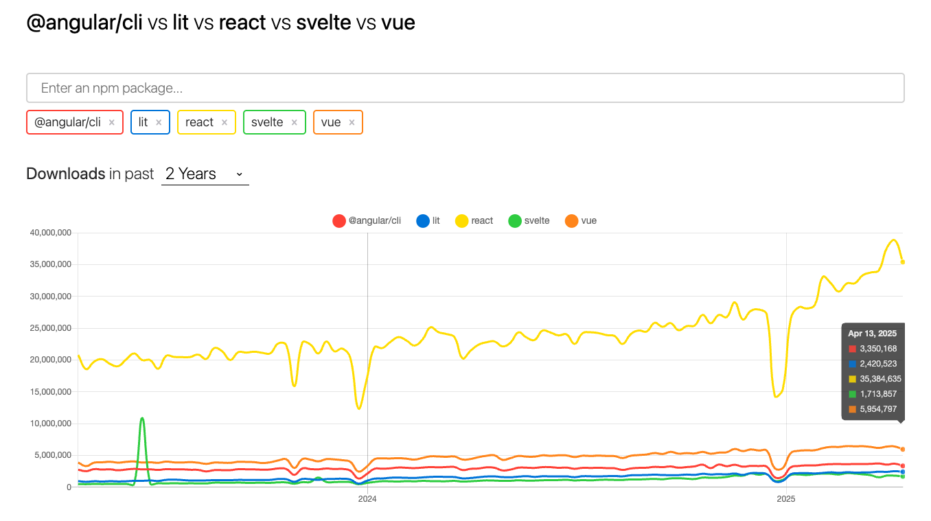
But that’s starting to change, as Lit has been steadily trending upward in popularity—and that’s not even counting CDN usage.
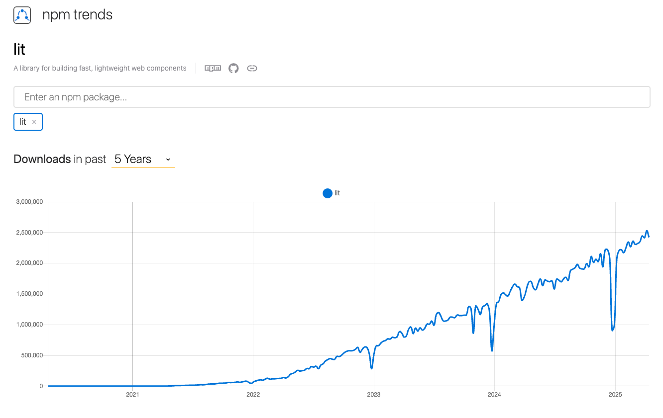
But there's still some way to go against the bigger frameworks. (Source for the images: https://npmtrends.com/@angular/cli-vs-lit-vs-react-vs-svelte-vs-vue)
As we saw big names are starting to take notice.
Microsoft has transitioned from React to Lit in its revamped web-based Windows App Store, aiming for a more modern and efficient user experience. Source
Reddit has also migrated its logged-out experience from React to Lit, citing significant performance improvements. Source
Google has been a proponent of Lit, developing and implementing it across various projects that work seamlessly with any framework or none at all. Source
So, it' fast, light and plays well with others. Interoperability is something most popular frameworks still struggle with, but Lit gets it right, it embraces the platform rather than trying to replace it. Lit supports supports modern browser APIs like adopted stylesheets, and lets you manage styles cleanly using JavaScript's CSSStyleSheet constructor. You can even share stylesheets across components without duplication.
Personally, I’ve been burned too many times by bloated frameworks that render hundreds of nodes just to put a simple button on the page.
Remember, each dependency is future tech debt and I've seen teams bury themselves into a hole they can't get out of.
Lit makes a lot of sense to me and best thing of all, it's opt-in: you use what you need, no hidden penalties, no extra baggage.
That said, developer experience is still catching up. Compared to React or Vue, the tooling, devtools support, and best practices around Lit/Web Components aren’t quite as mature. You’ll find yourself inventing a lot more patterns from scratch, especially on larger projects.
Overall, I really like where the technology is going. The future looks bright for Web Components—and Lit is a great example of how good things get when you stay close to the platform, stay lightweight, and stay adaptable. I would absolutely opt for Lit in simple front-end apps that rely on microservices and don't need server-side rendering. If server-side rendering is a must-have, Lit isn't quite ready yet. In those cases, more established solutions like Next.js might be the safer choice. It really comes down to your project requirements.
I will end on the following note, from a career standpoint, betting on a single framework is a sure path to a dead end.
The real dev super-power, especially in an AI world, is adaptability. Planning your entire career around one framework will leave you behind when the industry inevitably moves on. Could Lit replace React, possibly? Although, the consolidation of React is frightening (let's avoid that rabbit hole).
You should get comfortable with all the major frameworks, not just the ones that someone once told you was "good for your career", but stay curious about newer ones too, and Lit is one of those potential newer ones.